Showing posts with label conceptual art. Show all posts

Thursday, November 22, 2018

A Pacific Northwest Portfolio


I volunteer at a regional food bank in southern Oregon, which supplies local agencies rather than individuals.  We’ve had difficulty recruiting volunteers because of this.  Part of the problem is that we do not communicate who we really serve in our facilities, hence to prospective volunteers.  

I’ve begun a project of photographing recipients at the nineteen food pantries and community kitchens served by the United Community Action Network (UCAN) food bank in Douglas and Josephine Counties, Oregon.  

"Hunger", proposed as a billboard poster, 7' x 14', digital file
James Thatcher  copyright  2018

The idea behind this project is to communicate who we really serve, those in need, speaking their untold stories in the facilities where we serve them.  

Let’s humanize our facilities in order to more effectively engage those who are considering  volunteering with us.

Installation proposal, 24 units, each 20" x 16" x 10".

What if it were presented with a pallet of Campbell's Soup,
to be donated to the food bank after the exhibit?

Banana boxes are the ubiquitous containers used to ship, transfer, and distribute food in Oregon, and are an organic choice to support this imagery. 

The nature of “boxness” comes into play constantly:  what goes inside the box?


This portrait featuring Campbell’s soup draws a clear art historical reference, as well as a social reference to soup kitchens from the Great Depression, and a regional reference to the Campbell's Soup production facility just south of Portland, Oregon. 

"Shelf Stable", 2018, 19" x 35", Black and white gesso, latex paint
on reconstructed banana boxes, Campbell's Soup, rope light.
James Thatcher  copyright  2018


While conceptually astute, I maintain a studio for my practice.  It’s a practice that is hands on, technical, and sometimes messy.  I draw, paint, build, sculpt, and install, exploring materials and processes, often eschewing archival stability. 

Cardboard is not archival.  Each banana box has seen multiple cycles, and has become stained, stickered and worn.

"Relief", 20" x 16" x 60", 2018, banana boxes with florescent light. 
What if several filled a space?

There is nothing pretty or glamorous about feeding the hungry.  It’s urgent work with individuals who are sometimes emotional, sometimes desperate, sometimes unwashed.  The need is now, forget tomorrow and its worries. 

Archival, really?

"Food Insecurity", 2018, 96" x 80", Black gesso and latex paint
on banana boxes, stapled to loading pallets.
James Thatcher  copyright  2018

However, moving moments can be had in the midst of serving this population….  

Meeting the woman in Roseburg who shows up at 9am and stands, waiting for hours until the doors of the food pantry open at 1pm, so that she can obtain produce.  

The grateful couple who accessed their local pantry in Reedsport for years, who have now begun volunteering there.  

I met an elderly man in Myrtle Creek’s food pantry who was a long-distance trucker, and through it became disabled with sciatica.  

It’s caused me to be very conscientious about how I handle food during my volunteer shifts.

These are the faces of normal folks:  kids, moms, grandparents.  Who can afford not to be compassionate?


"The Light Shines Through Our Imperfections", 2018, 40" x 48",
Black and white gesso, latex paint on banana boxes
stapled to a loading pallet, two florescent lights.
James Thatcher  copyright  2018


Art as social practice necessarily confronts.  

This project began as a critique of UCAN’s lack of communication, while providing a solution for it.  This portfolio expands the discussion about food insecurity in our region, it promotes the Oregon Food Bank (located in Portland), and seeks to enlist viewers into the cause. 

Change happens one heart at a time.  That includes mine, swept up and renewed in the service to others.  The abundance of this heart expresses itself in artwork that promotes compassion, encouragement, and hope.
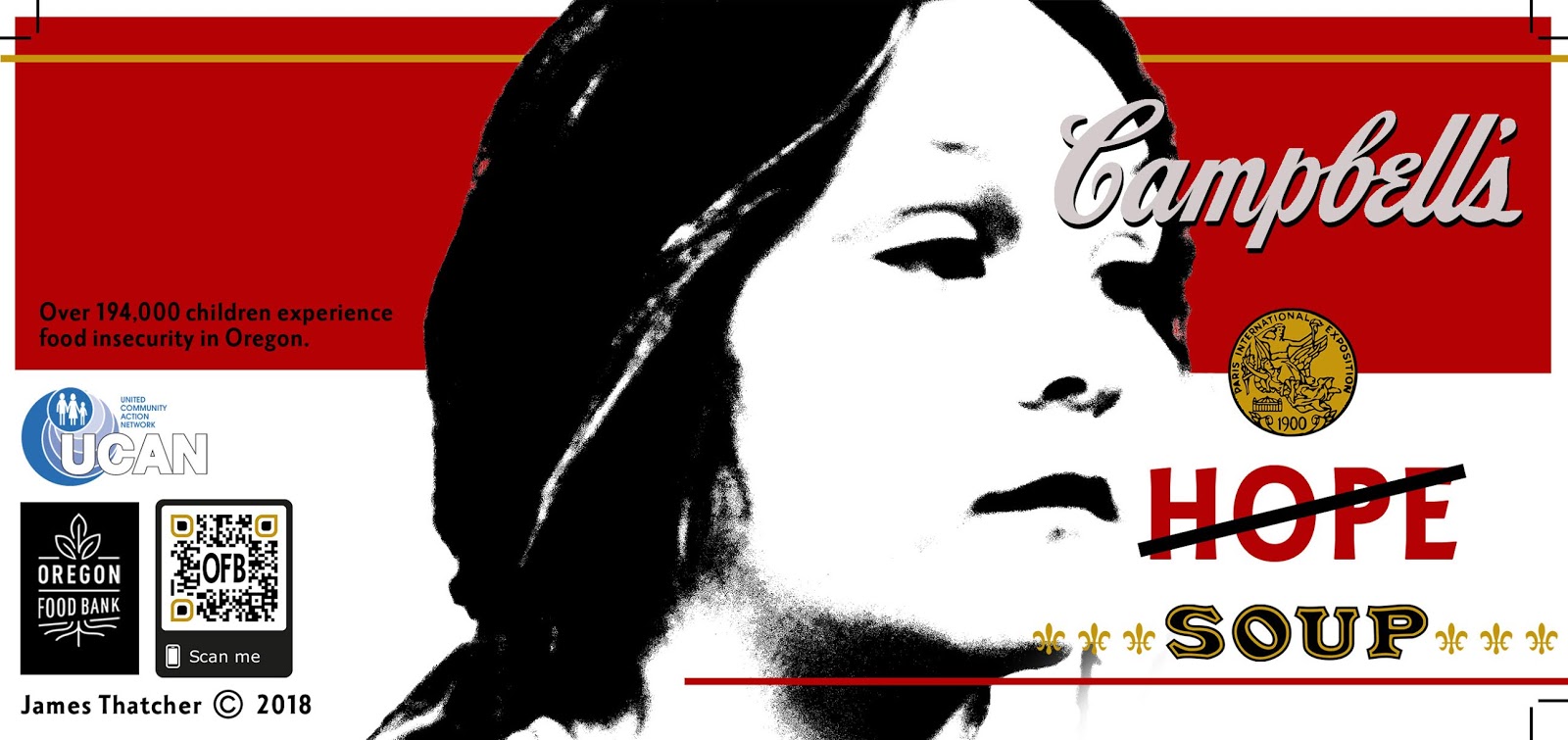
  
Custom Campbell's Soup can label, 8" x 4" nominal dimension, 2018, digital file.
James Thatcher  copyright  2018

Join me as an agent of cultural evolution.


Sunday, November 18, 2018

Biography as Art Practice


In 1982, one of my professors at the Corcoran College of Art & Design, Washington, DC (yes, that Corcoran) said that you could sweep the studio floor and put it into the artwork I was making. 
 
"The Spirit of Myth", 2004, 88" x 66", Latex Enamel, dirt, kitty litter, & wood chips on canvas
James Thatcher  copyright  2018

It was 15 years before I actually did that, but the essence of the comment was about making artwork that used the stuff of life as a medium.  This concept has led me to embed tree branches, bark, and leaves, or hay in paint, and employ parts and processes from a 24-year career as a cabinet maker into decades of artwork.  

"Chiaroscuro", 2015-18, 48" x 72", Latex enamel, hay, bulrushes, kitty litter
on plywood panel.  James Thatcher  copyright  2018


Detail, "Chiaroscuro", 2018, latex enamel, hay, bulrushes, kitty litter on plywood panel.

Installation view, 2014-18, acrylic on canvas.

But the 2008 financial crisis forced a retirement from cabinet making and changed everything.  I joined the staff of a missions-based ministry that I’d been volunteering with in southern Appalachia.  We did mission day trips every week, where I experienced the necessity, the power, and the joy of serving “the least of these.”
Now, 10 years later, I have reconnected with that passion as a volunteer for the United Community Action Network (UCAN) food bank in Roseburg, Oregon.  This portfolio is based on that volunteer work, both emotionally and by “using the stuff of it” as a medium.
  
"Portrait Box", one of 4 sides, 2018, 20" x 16" x 10",
Black & white gesso, latex paint on banana box.
James Thatcher  copyright  2018


"Portrait Box Rotation", 2018, Black & white gesso, latex paint on banana box.


"Food Insecurity", 2018, 96" x 80", Black gesso & latex paint
on deconstructed banana boxes, stapled to loading pallets.
James Thatcher  copyright  2018


The food distribution system, from the Oregon Food Bank in Portland, to UCAN, to the food pantries and recipients in Douglas County, relies on banana boxes as carriers.  As such, banana boxes are the natural choice for a substrate, along with loading pallets, to depict issues of food insecurity.

Proposed Installation, 24 units, 20" x 16" x 10"
Black & white gesso, latex paint on banana boxes
James Thatcher  copyright  2018

This portfolio speaks of my personal history in exploring art materials, of hands-on ministry, of experience in food distribution, and passion for confronting food insecurity. 


"The Light Shines Through Our Imperfections", 2018, 40" x 48"
Black & white gesso,latex paint on deconstructed banana boxes,
stapled to loading pallet, with two florescent lights.
James Thatcher  copyright  2018

My biography is reflected directly in my art practice.

Sunday, January 3, 2016

Incidental Discoveries are Crucial

An artist does an awful lot of artwork in a lifetime.  Ideas overtake our imaginations and we rush on generating ideas, sketches, artwork and proposals. 

Ideation Drawing:  Hexagon Variations  ©  James Thatcher  2012

Use a “focus project” to concentrate on a single successful image from those labors.  Produce 30 identical versions with no variation in size, process or subject matter. This will stabilize studio output and concentrate your art making processes and effort.  

And it will generate a market of strong reliable imagery. 

I’m in the midst of the second focus project in the past twelve months. The first focus project was 30 small paintings, 8” x 10” each.

Transformation Hexagon  © James Thatcher  2015
© James Thatcher  2015


This second effort is sculptural and the discoveries are compelling. 

In a 2-D focus project you only have finished work at the end of the process.  Suddenly you’ve got 30 finished pieces.  The joy and beauty of this 3-D focus project pops up in unexpected places as assembled sections need to be stored.  
 Proposal for Public Sculpture ©  James Thatcher  2015

These incidental discoveries are crucial.  They maintain creative interest during the long weeks and months of production. You don’t want to break the momentum of your epic focus project but these ideas can also be works in themselves.

18 Corner Pieces, Bamboo  ©  James Thatcher  2015
So be sure to photograph and make note of your ideas.  Also consider making drawings and paintings of these various stages after completing the main body of work.  They represent a strong direction for future artworks and possibly your career.


Creating 2-D artworks extends the depth of your 3-D portfolio.  It’s a separate/additional body of work that supports your sculpture installation.  They provide a wall mounted display to accompany your floor display in a pre-curated collection.    


Model for Sculpture/Painting Installation  ©  James Thatcher  2016
(What if this were a giant outdoor steel sculpture with a digital billboard behind it?)
The question of whether one is a sculptor or a painter is not relevant because the relationship between your 3-D and 2-D images is so clear.  You present the artwork of one artist who uses multiple mediums to explore their ideas.  

Brilliant!

The dedication displayed by presenting your ideas in a volume of related artworks is impressive.  Your vision is clearly defined and explored at a depth displayed only by the most professional of artists.  

(Welcome to the big time) 


Monday, March 16, 2015

Mathematics as Abstract Text

Grids, octagons, X-Y-Z axes, coordinates, parabolas…mathematics are increasing these days in the studio.  Equations, formulas, letters and numbers have become part of the expression.  They accompany geometric shapes and represent an aesthetic relief.


"Let f = F", Gesso on Roofing Felt, 72" x 36", © 2015

In 1982 the third year faculty at the Corcoran College of Art + Design (Washington, DC) became aware of my job experience as a sign maker.  Since then there has been a push to incorporate text into my artwork.  I became very self-conscious about it…what to say?  In those days I took the sign influence into the direction of graffiti.


Washington, DC, Dupont Circle 1984  Photo Richard K. Thomas


As part of a retrospective exhibit in the early 2000’s I painted individual words in a frieze section of the gallery. The selection of words was rife with meaning and hanging my large scale abstract paintings below them created interesting contexts.  

Installation View, "Excerpts", Lees-McRae College, Banner Elk, NC  2007

But text was not integrated into the imagery.

My struggle was with words themselves.  They’re so descriptive that they guide viewers thinking, perception and meaning.  I've had no problem with this as far as titles go. But actually using them in the artwork has continued to make me feel self-conscious.  I’ve tried to use text as texture by burying them under layers of paint but without success.

Now it seems that the use of geometric shapes demands these equations to emphasize the depth of the subject. The math is specific without being literal.  It’s an abstract language.  


"Untitled Hypar", Gesso and graphite on primed matboard, © 2015 Collection Steve Nyland

As such, I enjoy incorporating it freely into these recent artworks.  Many formulas are too long to use but sections are fun to place into these compositions.  The complexity makes for rich content. 
Underpainting, Gesso on Roofing Felt, 2015  https://www.youtube.com/watch?v=7FCVWpCgt1w


Using algebraic formulas touches on some difficult areas for me.  Algebra was incomprehensible when I was a high school freshman.  The basic concept of letters equaling “any number” was beyond me.  My dad taught math and science and worked with me to get a handle on it.  In spite of his tutoring it didn’t connect and was very frustrating!

I revisit these memories often as I continue this series of artwork.  It’s uncomfortable.   Algebra was my great academic melt down.  (Let’s not talk about Speech class.)  


Monday, October 27, 2014

The Curious Vision

Artwork is the perfect example of the whole being greater than the sum of its parts.


"Information" Hanne Darboven, 1973, artist's book, 72 pages

This dictum is well illustrated by a very unusual piece on display at the Hirshhorn Museum (Washington, DC) exhibition, “At the Hub of Things”.  The work by Hanne Darboven, entitled “27K-No8-No26” consists of nearly 150 typewritten sheets which are framed in classic skinny black metal frames.


The grid is fine, although the arrangement is asymmetrical:  7 rows of 19, and a bottom row of 16.  The bottom row is perhaps 4 feet below eye level so it isn’t immediately evident, but the arrangement is very curious.

And the typing on each page is also vastly curious:  mathematic formulas, groupings that add one character per sheet, hand written notes delineating every ten marks; enigmatic formulas that follow the arrangement of numerals, characters, punctuation marks…funky, bizarre, compulsive. 


The dozens of typewritten pages are not a single sequence.  Several different ideas make the collection all the more interesting.  I’ve never heard of this artist, but the piece got me to search a little, check it out, and learn some— pretty cool, pretty fun. 

Her work on Google Images reveals page after page as her modus operandi: whether scribbles, numbers (numerals actually), or equations, the incessant nature of her artwork/installations is a hallmark.

Hanne Darboven’s artwork at the Hirshhorn exhibition is quite unusual.  The ubiquitous 70’s grid got filled with Darboven’s personal formulas and mathematical progressions.  All that empty space, every bit of it is earnestly filled. 

”27K-No8-No26”, as its title might suggest, is different from the other pieces displayed at the Hirshhorn, even though it shared some basic formal elements of grid, repetition, and text.  Really different; it’s the result of an artwork which is entirely idea based, rather than aesthetically based.

(Hanne Darboven, photo by Gianfranco Gorgoni, date unknown)

Hanne Darboven’s artwork made me realize that I knew how to look at abstract paintings, but that viewing conceptual art was a different experience.  It was fun to have disorientation again when confronted by artwork--from the 70's!