Showing posts with label artists statement. Show all posts

Thursday, November 22, 2018

A Pacific Northwest Portfolio


I volunteer at a regional food bank in southern Oregon, which supplies local agencies rather than individuals.  We’ve had difficulty recruiting volunteers because of this.  Part of the problem is that we do not communicate who we really serve in our facilities, hence to prospective volunteers.  

I’ve begun a project of photographing recipients at the nineteen food pantries and community kitchens served by the United Community Action Network (UCAN) food bank in Douglas and Josephine Counties, Oregon.  

"Hunger", proposed as a billboard poster, 7' x 14', digital file
James Thatcher  copyright  2018

The idea behind this project is to communicate who we really serve, those in need, speaking their untold stories in the facilities where we serve them.  

Let’s humanize our facilities in order to more effectively engage those who are considering  volunteering with us.

Installation proposal, 24 units, each 20" x 16" x 10".

What if it were presented with a pallet of Campbell's Soup,
to be donated to the food bank after the exhibit?

Banana boxes are the ubiquitous containers used to ship, transfer, and distribute food in Oregon, and are an organic choice to support this imagery

The nature of “boxness” comes into play constantly:  what goes inside the box?


This portrait featuring Campbell’s soup draws a clear art historical reference, as well as a social reference to soup kitchens from the Great Depression, and a regional reference to the Campbell's Soup production facility just south of Portland, Oregon. 

"Shelf Stable", 2018, 19" x 35", Black and white gesso, latex paint
on reconstructed banana boxes, Campbell's Soup, rope light.
James Thatcher  copyright  2018


While conceptually astute, I maintain a studio for my practice.  It’s a practice that is hands on, technical, and sometimes messy.  I draw, paint, build, sculpt, and install, exploring materials and processes, often eschewing archival stability. 

Cardboard is not archival.  Each banana box has seen multiple cycles, and has become stained, stickered and worn.

"Relief", 20" x 16" x 60", 2018, banana boxes with florescent light. 
What if several filled a space?

There is nothing pretty or glamorous about feeding the hungry.  It’s urgent work with individuals who are sometimes emotional, sometimes desperate, sometimes unwashed.  The need is now, forget tomorrow and its worries. 

Archival, really?

"Food Insecurity", 2018, 96" x 80", Black gesso and latex paint
on banana boxes, stapled to loading pallets.
James Thatcher  copyright  2018

However, moving moments can be had in the midst of serving this population….  

Meeting the woman in Roseburg who shows up at 9am and stands, waiting for hours until the doors of the food pantry open at 1pm, so that she can obtain produce.  

The grateful couple who accessed their local pantry in Reedsport for years, who have now begun volunteering there.  

I met an elderly man in Myrtle Creek’s food pantry who was a long-distance trucker, and through it became disabled with sciatica.  

It’s caused me to be very conscientious about how I handle food during my volunteer shifts.

These are the faces of normal folks:  kids, moms, grandparents.  Who can afford not to be compassionate?


"The Light Shines Through Our Imperfections", 2018, 40" x 48",
Black and white gesso, latex paint on banana boxes
stapled to a loading pallet, two florescent lights.
James Thatcher  copyright  2018


Art as social practice necessarily confronts.  

This project began as a critique of UCAN’s lack of communication, while providing a solution for it.  This portfolio expands the discussion about food insecurity in our region, it promotes the Oregon Food Bank (located in Portland), and seeks to enlist viewers into the cause. 

Change happens one heart at a time.  That includes mine, swept up and renewed in the service to others.  The abundance of this heart expresses itself in artwork that promotes compassion, encouragement, and hope.
  
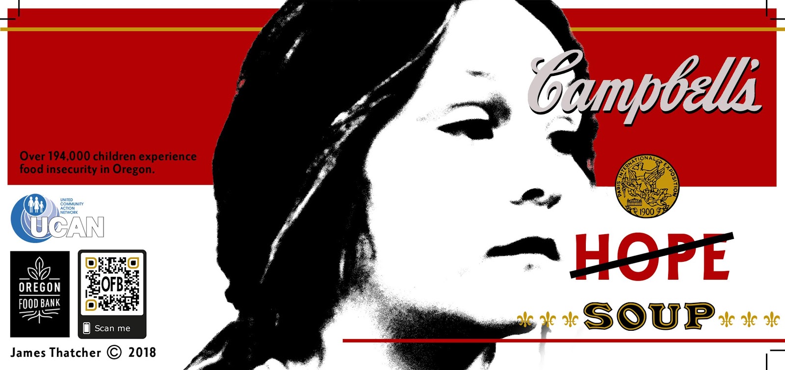
Custom Campbell's Soup can label, 8" x 4" nominal dimension, 2018, digital file.
James Thatcher  copyright  2018

Join me as an agent of cultural evolution.


Monday, March 16, 2015

Mathematics as Abstract Text

Grids, octagons, X-Y-Z axes, coordinates, parabolas…mathematics are increasing these days in the studio.  Equations, formulas, letters and numbers have become part of the expression.  They accompany geometric shapes and represent an aesthetic relief.


"Let f = F", Gesso on Roofing Felt, 72" x 36", © 2015

In 1982 the third year faculty at the Corcoran College of Art + Design (Washington, DC) became aware of my job experience as a sign maker.  Since then there has been a push to incorporate text into my artwork.  I became very self-conscious about it…what to say?  In those days I took the sign influence into the direction of graffiti.


Washington, DC, Dupont Circle 1984  Photo Richard K. Thomas


As part of a retrospective exhibit in the early 2000’s I painted individual words in a frieze section of the gallery. The selection of words was rife with meaning and hanging my large scale abstract paintings below them created interesting contexts.  

Installation View, "Excerpts", Lees-McRae College, Banner Elk, NC  2007

But text was not integrated into the imagery.

My struggle was with words themselves.  They’re so descriptive that they guide viewers thinking, perception and meaning.  I've had no problem with this as far as titles go. But actually using them in the artwork has continued to make me feel self-conscious.  I’ve tried to use text as texture by burying them under layers of paint but without success.

Now it seems that the use of geometric shapes demands these equations to emphasize the depth of the subject. The math is specific without being literal.  It’s an abstract language.  


"Untitled Hypar", Gesso and graphite on primed matboard, © 2015 Collection Steve Nyland

As such, I enjoy incorporating it freely into these recent artworks.  Many formulas are too long to use but sections are fun to place into these compositions.  The complexity makes for rich content. 
Underpainting, Gesso on Roofing Felt, 2015  https://www.youtube.com/watch?v=7FCVWpCgt1w


Using algebraic formulas touches on some difficult areas for me.  Algebra was incomprehensible when I was a high school freshman.  The basic concept of letters equaling “any number” was beyond me.  My dad taught math and science and worked with me to get a handle on it.  In spite of his tutoring it didn’t connect and was very frustrating!

I revisit these memories often as I continue this series of artwork.  It’s uncomfortable.   Algebra was my great academic melt down.  (Let’s not talk about Speech class.)  


Saturday, November 22, 2014

Rebellion Became an Embrace

For about 25 years I was a cabinet maker.   It’s a world of minute detail:  blueprints, trim, and tight spaces.  Add to that delicate finishes, matching color samples, and pristine installations in expensive homes.


Creating large scale abstract art was a way of taking a break from the fastidiousness of the trade.  Throwing, splashing, thrashing, and dripping fields of paint became a refuge from the demands of the industry. 

However, at the turn of the century circumstances led to a break from cabinet making, as I spent several seasons remodeling and finishing my parent’s home in Michigan’s Upper Peninsula.  

About five years later, my bride’s career in higher education took us to the mountains of North Carolina. I found myself back in the field of high end interior woodworking.  


A custom Maple entry door.

After several years of carpentry and drywall, I found myself poorly suited to the demands of cabinet making.  I’d lost my edge….

It took a few years to sharpen up. Those times were marked with frustration and dissatisfaction and eventually with the real estate collapse of 2008 I was laid off.  I’ve kept my tools but haven’t returned to cabinet making.

Deb’s career has gone forward and the opportunity to pursue my art career is in full flight.  I make this preamble to say that I don’t have much to rebel against any more:  times are good.

As such, the thrashing and running paint techniques of my large scale abstract art had become more of a habit than a reality.  Interestingly, now that the requirements of the field are removed I have discovered that the skills and orientation of my woodworking experience persist.


They have filtered back into my creative life.  

After being away for five years the clean lines and processes re-emerge.  I am not back in the shop polishing fine hardwoods, but I am drafting, laying down clean edges, building structures and enjoying the technical facility that decades of shop experience has instilled in me.  Yay!

The contrary days have passed.  These are quieter thoughtful times.  The means have changed, and the ends necessarily so.  What was rebellion has become an embrace. 


Monday, October 6, 2014

The Stillness Project


When I read the phrase, “Receive my Peace” in Susan Young’s daily devotional Jesus Calling I knew I had the bones of a nice inspirational image for the Facebook.

In the throes of my new grid based artworks, the idea had morphed into arrays of individual panels.  I’d just completed a couple dozen small white boxes.  Moving the piles around had gotten interesting as I began stacking them artfully.  I’d taken 62 photos as each box added to the stack made for a new arrangement.

There would be plenty to choose from to illustrate the “Receive My Peace” concept.


Surprisingly, this was not the case.  Looking with the guiding principle of “Peace” I found these images—every one of them—very busy.  

This was disturbing.  I thought that these little white boxes were undeniably quiet works.  No.


For a guy who uses “Out of the abundance of the heart the mouth speaks,” (Matthew 12:34) in his artist’s statement, I had some thinking to do.
Cube Drawing,  Graphite and Acrylic on Prepared Paper  1993  ©   James Thatcher


What was peace and how is it expressed?


Layout Template for "Discovering the Broken Obelisk" , Artist's Book, The Art Library, Brooklyn, NY
The concept of “stillness” came forward:  the square is a practical expression of equilibrium and balance because it is equal on all sides.  It can be an effective symbol of stillness.  

Surface quality was something to consider as well.  Is my signature heavy texture indicative of peace?  Not so much…

Then, in a conversation with a friend about “The Stillness Project” the idea of the color of peace came up.  What is the color of peace?  
Yves Klein regarding the color "Blue"     photo credit Harry Shunk

Perhaps it’s not one color but a range with peaceful application? 


This is the path I am choosing at the moment.  


Peace is alert with conscious choices occurring.  It isn’t sleep, right?  It’s a state of being.  Going back to the original idea, we are to “Receive His Peace”.  Being in the world, but not of the world; it is a gift from The Prince of Peace which we either accept or reject.  

Continually.


Saturday, June 28, 2014

YES! The Artist Speaks


From a reception for local donors to The New Vision Heron Mural:

I’d like to begin with one word, because that is how this project and everything associated with it began.  It’s a small word, but a beautiful and powerful word:  YES! 

When we say “Yes” individually, doors open and change begins.  Being in agreement with an idea, a statement, or proposal means that it goes forward with our blessing. 

When Lee Whaley said, “Yes, I will pursue having the heron mural redone”, the idea went forward in strength; blessed with her skill and experience.  And look where we are! 

When I said, “Yes, I will do the mural”, it opened up 3 years of experience:  From research and design to committee approval, online crowd source fundraising, and fabrication;  Then press coverage as well as getting to write my own guest blog article.  It meant mounting an accompanying exhibit, not to mention reconnecting with my past…everything made possible by one word. 

It’s one word, but it has needed many voices. 

When we collectively say, “Yes”, WE create opportunity.  WE empower those who are asking to make something happen—WE are in agreement with the happening of an idea, and are instrumental in its formation, it’s becoming a reality. 

“Yes” extends our world.  It expands our reality.  It creates possibility.  It unleashes the power to get results.  It represents a decision, a course of action, and a responsibility.  

The responsibility to honor those who agree to support, because now your sound judgment goes on display—the responsibility to verify your support AS SOUND JUDGEMENT.  

Thank you for your support.  Thank you for your affirmation.  Thank you for YOUR vision. 

When you drive by your mural think about this.  Think “YES” for your town, your downtown, and for what might present itself next.  Now you’ve got some experience with the power of your support.  It’s the power of your choice, your voice, your vote. 

You gave me an opportunity by saying “Yes”, and now we stand together with a new vision-- in a new vision.  Thank you for your confidence…it has been a soul changing experience.


Additionally, here's a link to a guest blog post I was invited to write for Artsy Shark about public speaking for artists:


http://jtnwdc.wix.com/jamesthatcherarts


Friday, May 30, 2014

ARTIST'S STATEMENT


Jesus said that out of the abundance of the heart the mouth speaks.  I believe this and extend it to all communication, including visual art.  The random techniques of Abstract Expressionism and Surrealism express directly the joie de vivre abundant within me by the Holy Spirit.  

However, in recent pieces imagery is reduced to panels of texture, bridging into a gritty form of Minimalism.  Whether chunky or slick, the materials are being emphasized and are more expressive in spite of the paintings increasingly stoic forms. 

I edit heavily.   I pile on paint and thickly textural elements like leaves, grasses or bark.  The latest works feature hay from my dairy barn studio and cat tails gathered from marshes in upstate New York.  I use local elements as a way of assimilating my environment and regional culture. 

After embedding these elements into the paint I scrape off what I can.  Of what remains, I isolate the lines and shapes that are the essence of the chaotic underpainting.  The experience and process of this discovery motivates my creative urge.  I look for surprise in materials, process and imagery, as surprise is the beginning of delight!


Wednesday, February 26, 2014

Conversation with a Friend


Hey Gregory,

Interesting questions and I don’t like my answers to any of them.

 Not selling anything regularly—some small stuff, prints from the website occasionally, a larger piece a couple years back.  Nothing big.

Collections…nothing too grand for painting:  Richard K. Thomas, a DC journalist (now retired—he was who brought me to DC from northern Michigan).  And a local businessman who bought the larger piece a couple years back.

Because of a strategic alliance in the ‘90’s with Mitzi Perdue of poultry fame, I have samples of my woodworking in some good private and state collections, including Bill Clinton, Lady Bird Johnson, former Chinese premier Deng Xiaoping, former German Chancellor Helmut Kohl, and the Perdues; as well as a jewelry box for CNN news personality Paula Zahn.  But….

Peer group?  No.

Art History?

Absence? 

My interest is in making good work, rather than art history.  As such it probably does more to promote art history rather than actually make art history.  Personal relevance is important, and the process of “making something out of nothing” is key for me.  I believe that we express ourselves out of the abundance of our heart, our core—I know that.  Does that contribute to art history?  It does contribute to the culture…and give meaning to my life and the doing of the stuff that I do…where is art history taking place, Gregory?  Who is it affecting? 

Projecting computer art on the walls of the campus may do more for art history than anything, because it’s that random encounter with artwork—big, unusual, and there in your path folks.  It may actually stick with someone--it may be more memorable than  typical art venue exposure.  I really like the graffiti on the trains that pull through town—same thing of big art flashing by unexpectedly.  A lot of it looks the same but still…I do appreciate it, and seeing it.

As far as “Absence”, what does Joan Mitchell’s work say in her absence?  Sam Francis?  How about James Turrell?  Aha!  And Pollock—Yes!  Warhol—I think I’m catching on….

I’m looking to surprise myself as I create; I believe that the surprise is contained in the finished product and possesses a certain “Wow!” factor.  That’s my deal right now—“look where this one went!”  Maybe create a little intrigue about how it got there….

Interesting questions.  Why do you ask?

Monday, November 11, 2013

The Wow of James Turrell


I’ve noticed myself speaking very excitedly about the Turrell retrospective at the Los Angeles County Museum of Art—much more excited than what I felt while viewing the show. 
Especially in Turrell’s immersion artworks:  to be conscious and aware in such an unusual environment is disturbing (pleasantly), disorienting (I can imagine walking into a wall without realizing it were there), and other-worldly. 

Maybe “other-worldly” is the right term.  In a work like “Breathing Light” (2013)  you are surrounded by colored light and exist in a physical space which doesn’t allow for any other experience… sound isn’t a part of the installation, touch isn’t relevant…taste and smell, forget about it.


"Breathing Light"
But there you are in this colored space…you’re not dreaming.  This is a real place, but unlike anything you’ve ever experienced before.  Sense deprivation is a field of study for Turrell, and it is typically in a laboratorial, if not negative context (solitary confinement); but this is so extravagant and rich.  Indulging the sense of sight so thoroughly and without detail brings into play the mechanics of vision—the way the eye scans and moves to gather information—and what about afterimages?
"Breathing Light", view from waiting area

By the time you emerge from the retrospective you feel like the scales have been removed from your eyes (Acts 9:17-18) .  Having been under the exclusive influence of light and color for one to two hours, I wonder what I’ve been involved with, really.  The spiritual references to light speak of understanding, clarity and glory. 

"Skyscape"


The physicality of light, which I’ve never considered or encountered before now, is wavelengths or vibrations.  Breaking the human experience down to one element (light) and continuously exposing viewers to that singular experience renders an increasingly physical effect/impact on the viewer.
 “What is happening to me?” is a question that occurs during this experience.  Perhaps nothing or nothing that isn’t quickly restored upon leaving the museum and returning to daylight and the bustle of Wilshire Blvd.  Darn it.


On our flight back east I began reflecting on all of this.  Detail is eye pleasing—the eye hungers for it.  My window view from the airplane confirmed it:  I spent a lot more time looking down than up—you see the sky, you get it—but the landscape below was changing constantly and filled with detail and texture…fascinating. 

 I got excited, realizing that Turrell’s work is not eye pleasing.  It forces us to look at terrifically little; as such it goes against the nature of the eye.

etchings


The three dimensional references of the early work (the gorgeous etchings, as well as the light projections like “Juke”) are done away with in the shallow space installation, “Raemar Pink White”, as well as in the immersion installations, like "Breathing Light."
"Raemar Pink White" (shallow space installation)

In the latest works the edges, seams and planes of the viewing space are removed, giving our eyes even less information.  There are fewer and fewer references to our previous experiences, our world.

"Breathing Light"


I left the museum feeling like a spiritual being:  sensitive, reduced by stages through each progressive work.  I felt as if I’d experienced the creation, through man-made spaces, ordered experiences and sensory deprivation/indulgence.  Turrell reduces this world and the vastness of creation to a focused experience of the first element, light.  His stated interest is in creating experiences rather than “art”....

Job well done, sir, and thank you for the memories.  Wow!