Showing posts with label grid. Show all posts

Saturday, January 17, 2015

The Tree of Life

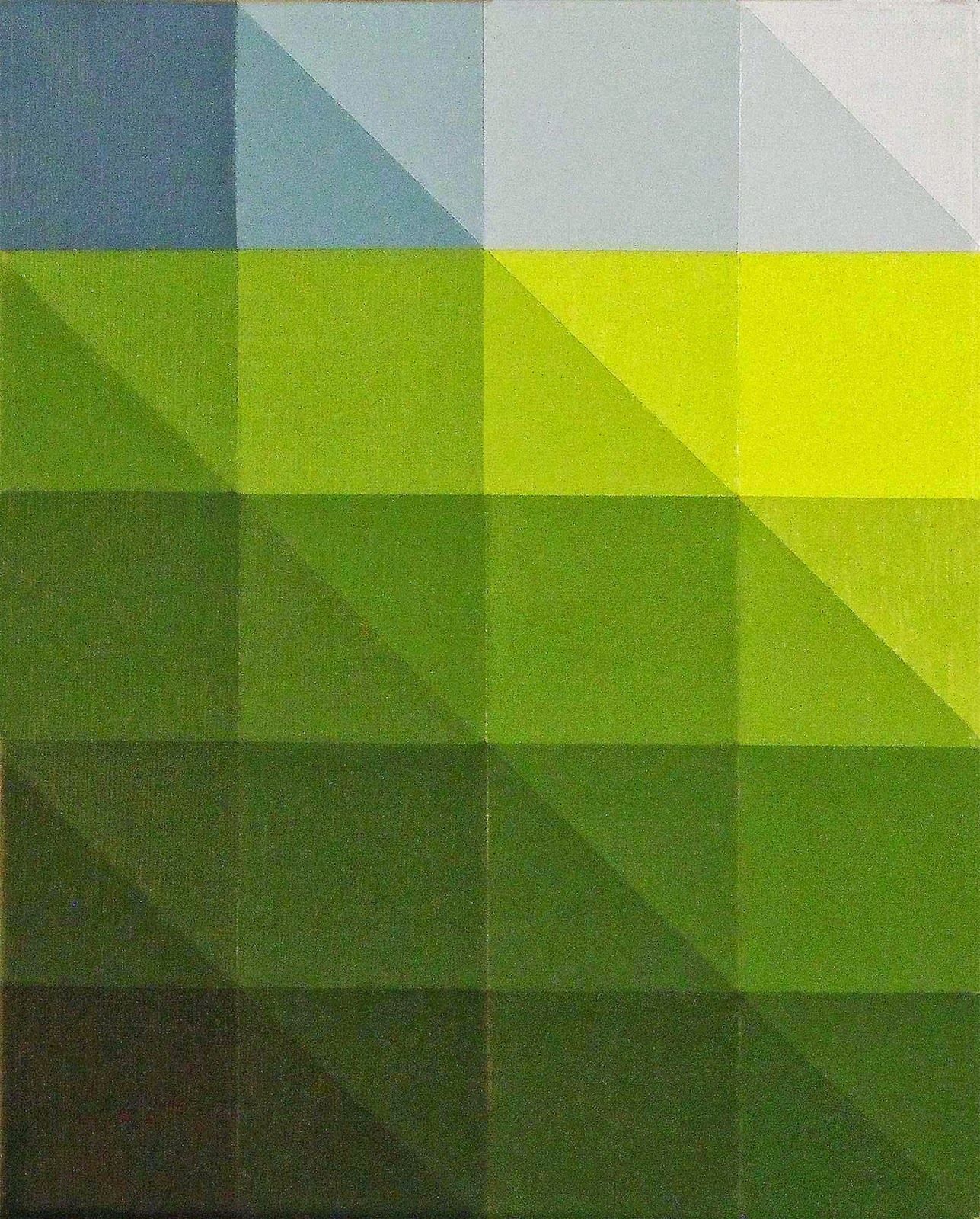
I was working smaller to crank out ideas for large scale grid paintings.  As this study was nearly finished I noticed a shape lurking in the axes of all those squares:


An ideation sequence from 2012 ended in this shape (see “Finding the BrokenObelisk”) and it was exciting to see again. To have it reappear naturally was a pleasant surprise. 


Suddenly I knew the direction.  It was as if the grid was the way to get to this hexagon shape.  Fine with me!  I dropped the grid and went full tilt, working that hexagon shape.


A hexagon is a six-sided figure with six angles and six vertices.  We all think of the honeycomb but a hexagon is not necessarily equilateral—the sides don’t all have to be the same length.  


I didn’t labor over this but it came to be more important as time went on.


I was rolling with this image, not worrying about anything except what the next idea was:  boom, boom, boom went the artwork!

*******************

The holidays were upon us and my wife and I went away for a week or so.  No art production, just vacation, visiting, watching football—a great break.  We come home and instead of jumping back into art production I took a day to reorganize.

Then I decided that I needed to do a little research about hexagons, look into their symbolism.  Without the Christmas break I would have forged on with my head down and brow furrowed, painting away...


It was time to hit the search engine.  Things got interesting quickly.

First, some general connotations:  communication, interfacing, union (consider honeycombs and bee society), and balance.  Then GOLD:  The elongated hexagon that I’ve been working with was a variation of  “The Tree of Life.”


As a Christian, this floored me!  I was steamrolling with this image; producing it over and over again in various forms, like the guy in “Close Encounters of the Third Kind”.  Then finding out its meaning…!  

This studio experience is good example of God’s “still small voice.”  (Check out 1st Kings 19:11-12)  You are motivated, you know it’s right, you aren’t struggling with it, you’re producing.  And you’re clueless!  That’s one of the best parts!  Then you find out what you’re doing, and THAT’S the best part!


Go boldly forward.  If the creative urge is that strong then do yourself the favor of following it.  In fact, push it!  Believe that it will become clear in due time, that what you are doing is meaningful; even if you don’t understand it now.

Greater forces are at work.


Monday, October 27, 2014

The Curious Vision

Artwork is the perfect example of the whole being greater than the sum of its parts.


"Information" Hanne Darboven, 1973, artist's book, 72 pages

This dictum is well illustrated by a very unusual piece on display at the Hirshhorn Museum (Washington, DC) exhibition, “At the Hub of Things”.  The work by Hanne Darboven, entitled “27K-No8-No26” consists of nearly 150 typewritten sheets which are framed in classic skinny black metal frames.


The grid is fine, although the arrangement is asymmetrical:  7 rows of 19, and a bottom row of 16.  The bottom row is perhaps 4 feet below eye level so it isn’t immediately evident, but the arrangement is very curious.

And the typing on each page is also vastly curious:  mathematic formulas, groupings that add one character per sheet, hand written notes delineating every ten marks; enigmatic formulas that follow the arrangement of numerals, characters, punctuation marks…funky, bizarre, compulsive. 


The dozens of typewritten pages are not a single sequence.  Several different ideas make the collection all the more interesting.  I’ve never heard of this artist, but the piece got me to search a little, check it out, and learn some— pretty cool, pretty fun. 

Her work on Google Images reveals page after page as her modus operandi: whether scribbles, numbers (numerals actually), or equations, the incessant nature of her artwork/installations is a hallmark.

Hanne Darboven’s artwork at the Hirshhorn exhibition is quite unusual.  The ubiquitous 70’s grid got filled with Darboven’s personal formulas and mathematical progressions.  All that empty space, every bit of it is earnestly filled. 

”27K-No8-No26”, as its title might suggest, is different from the other pieces displayed at the Hirshhorn, even though it shared some basic formal elements of grid, repetition, and text.  Really different; it’s the result of an artwork which is entirely idea based, rather than aesthetically based.

(Hanne Darboven, photo by Gianfranco Gorgoni, date unknown)

Hanne Darboven’s artwork made me realize that I knew how to look at abstract paintings, but that viewing conceptual art was a different experience.  It was fun to have disorientation again when confronted by artwork--from the 70's!


Monday, October 6, 2014

The Stillness Project


When I read the phrase, “Receive my Peace” in Susan Young’s daily devotional Jesus Calling I knew I had the bones of a nice inspirational image for the Facebook.

In the throes of my new grid based artworks, the idea had morphed into arrays of individual panels.  I’d just completed a couple dozen small white boxes.  Moving the piles around had gotten interesting as I began stacking them artfully.  I’d taken 62 photos as each box added to the stack made for a new arrangement.

There would be plenty to choose from to illustrate the “Receive My Peace” concept.


Surprisingly, this was not the case.  Looking with the guiding principle of “Peace” I found these images—every one of them—very busy.  

This was disturbing.  I thought that these little white boxes were undeniably quiet works.  No.


For a guy who uses “Out of the abundance of the heart the mouth speaks,” (Matthew 12:34) in his artist’s statement, I had some thinking to do.
Cube Drawing,  Graphite and Acrylic on Prepared Paper  1993  ©   James Thatcher


What was peace and how is it expressed?


Layout Template for "Discovering the Broken Obelisk" , Artist's Book, The Art Library, Brooklyn, NY
The concept of “stillness” came forward:  the square is a practical expression of equilibrium and balance because it is equal on all sides.  It can be an effective symbol of stillness.  

Surface quality was something to consider as well.  Is my signature heavy texture indicative of peace?  Not so much…

Then, in a conversation with a friend about “The Stillness Project” the idea of the color of peace came up.  What is the color of peace?  
Yves Klein regarding the color "Blue"     photo credit Harry Shunk

Perhaps it’s not one color but a range with peaceful application? 


This is the path I am choosing at the moment.  


Peace is alert with conscious choices occurring.  It isn’t sleep, right?  It’s a state of being.  Going back to the original idea, we are to “Receive His Peace”.  Being in the world, but not of the world; it is a gift from The Prince of Peace which we either accept or reject.  

Continually.


Sunday, September 7, 2014

35 Years Later: The Monet Experience

In autumn of 1980 I lived with the Richard K. Thomas family in Potomac, MD for 3 months and ended up staying in Washington, DC for 10 years. During those first months Rich and I would ride into DC almost daily—Rich to his office and post as Chief Economic Correspondent for Newsweek Magazine, me to museums and galleries to gorge on art.


On a visit to the National Gallery (West Wing) I found copyists diligently working before paintings of old.  This was like something out of an art history book where artists of a certain period copied the masters.  I decided I’d better do the same if I had any intention of being a serious artist.

A brilliant job of rendering Rembrandt

Quick conversations with the copyists got me to the Registrar's Office for my own application.  (You can review the process for receiving a copyist permit for the National Gallery's West Wing here.)  A month later, after reference letters, the interview and background checks I was in the mix.  

I made two dreadful renditions of Monet’s “Rouen Cathedral in Afternoon Light”.  One wasn’t enough.  Clearly Monet didn’t have Grumbacher oil paints at his disposal during the late 1800’s…and my canvases weren’t proportioned correctly….  Still it was surprising that the second copy was no better than the first.  Luckily no photo evidence exists of this work.

But the experience is all about the influence, rather than the objects themselves.  Monet’s palette became internalized regardless of mismatching colors.  I chose Monet because I was having color problems, (which continued), but decades later this experience is where I go for color choices and relationships.  

The real deal, Monet's "Rouen Cathedral in Afternoon Light"

More subtle and surprising was the effect of the Impressionist surface.  Texture has become a subject in its own right in my recent work.  I’ve been doing fairly heavy textures in my artwork since 1992, referencing  Julian Schnabel and Anselm Kiefer's paintings from the 1980’s.  But this interest really traces back to the Monet experience.

Hay and Bulrushes embedded in Latex Paint, 1 of 18, "Arrayed", James Thatcher © 2014

Reducing my imagery in the recent grid paintings, I’ve come to understand the profound influence of copying Monet.  Not in becoming a plein air painter; not in terms of emulating Impressionism, but in fundamental terms of palette and surface texture. 

"After Monet", Cat Litter, Wood Chips, Latex Paints and Acrylic on Canvas, James Thatcher © 2004-2014


Color and texture are my current subject matter.  Thirty-five years later essential elements of the Monet experience fuel my work.  Who would know, who could tell?  It wasn’t exactly copying the “old masters” but it has provided a constant foundation to my paintings and technique.  


"Monet Rouge", Hay, Bulrushes, Latex Paint and Acrylic on Plywood Panel, James Thatcher © 2014

Copying Monet's "Rouen Cathedral in Afternoon Light" hasn’t been the only influence on my artwork, but it has been fascinating to see it in light of current developments in the studio.  I was surprised and wanted to share the discovery.