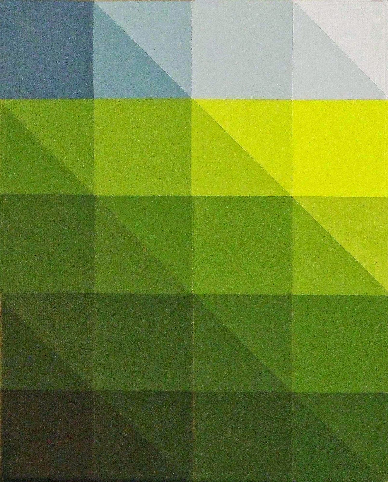
Sunday, February 1, 2015

Focus Project

I’m making thirty identical paintings.  They're each 8” x 10” and modeled after a study of a blue gradient Tree of Life hexagon.  

"Transformation Hexagon"  ©  2015
This image's step-by-step process make it a natural choice for this sort of project.  Focusing on the same shape, same colors, same process, technique and size will yield the same result X 30.


This is the most controversial assignment given by our faculty at the Corcoran College of Art + Design (Washington, DC, 1980’s). However, it was given after 2 months of free range creativity. Nobody mentioned it, but the piles of artwork generated during that first stage were about discovering our modus operandi and ONE image.  

A piece that summed up the range of our unfettered production; our free association, lateral thinking, uninhibited choices in art making that sidestepped our fault-finding, self-filtering, uptight, judgmental fearful selves.

Duplicating that one piece thirty times through the Focus Project was an exercise in discipline and an example of what to do when you found that idea worth pursuing.

Sometimes logistics becomes sculpture.
We do an awful lot of artwork in a lifetime.  We produce drawings and sketches, and ideas that take over our imaginations.  We rush on to generate more ideas, sketches, and proposals…. 


And then what--continue the search for “the next big thing”?  Ugh….

Let’s stay with that brilliant, reduced idea.  Why discard it in the search for another?  They're worth holding onto.  When you find it, focus.  

A focus project brings a meditation on an image, finding out all that it holds and in the process of re-iteration controlled progress reveals itself.  

Side work produced during the current Focus Project.
Thinking becomes ordered, step-by-step instead of random.  Your body of work becomes cohesive and its coherence is evident.  Clarity becomes a trait of your artwork and process.  The directions you take become manageable choices that your clients and fan base follow as well.

Dare to impose a little discipline into the mix.  Hammer out thirty!  You might like it.  If nothing else, you’ll find a few that really sing!  You’ll internalize the image, as well as the focus processes and the multiples aesthetic.  You’ll have that ability and insight as a permanent part of your creative options.  

Who can argue with increasing one’s creative options?  

It’s an investment in yourself; in your discovery.  Your work merits the investigation.  This sort of output declares the importance of your own thinking, research and imagery.

And here’s a surprise:  I’m not making 30 paintings, I’m making one. 

                                                                                                        
 http://jtnwdc.wix.com/jamesthatcherarts                        

Saturday, January 17, 2015

The Tree of Life

I was working smaller to crank out ideas for large scale grid paintings.  As this study was nearly finished I noticed a shape lurking in the axes of all those squares:


An ideation sequence from 2012 ended in this shape (see “Finding the BrokenObelisk”) and it was exciting to see again. To have it reappear naturally was a pleasant surprise. 


Suddenly I knew the direction.  It was as if the grid was the way to get to this hexagon shape.  Fine with me!  I dropped the grid and went full tilt, working that hexagon shape.


A hexagon is a six-sided figure with six angles and six vertices.  We all think of the honeycomb but a hexagon is not necessarily equilateral—the sides don’t all have to be the same length.  


I didn’t labor over this but it came to be more important as time went on.


I was rolling with this image, not worrying about anything except what the next idea was:  boom, boom, boom went the artwork!

*******************

The holidays were upon us and my wife and I went away for a week or so.  No art production, just vacation, visiting, watching football—a great break.  We come home and instead of jumping back into art production I took a day to reorganize.

Then I decided that I needed to do a little research about hexagons, look into their symbolism.  Without the Christmas break I would have forged on with my head down and brow furrowed, painting away...


It was time to hit the search engine.  Things got interesting quickly.

First, some general connotations:  communication, interfacing, union (consider honeycombs and bee society), and balance.  Then GOLD:  The elongated hexagon that I’ve been working with was a variation of  “The Tree of Life.”


As a Christian, this floored me!  I was steamrolling with this image; producing it over and over again in various forms, like the guy in “Close Encounters of the Third Kind”.  Then finding out its meaning…!  

This studio experience is good example of God’s “still small voice.”  (Check out 1st Kings 19:11-12)  You are motivated, you know it’s right, you aren’t struggling with it, you’re producing.  And you’re clueless!  That’s one of the best parts!  Then you find out what you’re doing, and THAT’S the best part!


Go boldly forward.  If the creative urge is that strong then do yourself the favor of following it.  In fact, push it!  Believe that it will become clear in due time, that what you are doing is meaningful; even if you don’t understand it now.

Greater forces are at work.


Saturday, November 22, 2014

Rebellion Became an Embrace

For about 25 years I was a cabinet maker.   It’s a world of minute detail:  blueprints, trim, and tight spaces.  Add to that delicate finishes, matching color samples, and pristine installations in expensive homes.


Creating large scale abstract art was a way of taking a break from the fastidiousness of the trade.  Throwing, splashing, thrashing, and dripping fields of paint became a refuge from the demands of the industry. 

However, at the turn of the century circumstances led to a break from cabinet making, as I spent several seasons remodeling and finishing my parent’s home in Michigan’s Upper Peninsula.  

About five years later, my bride’s career in higher education took us to the mountains of North Carolina. I found myself back in the field of high end interior woodworking.  


A custom Maple entry door.

After several years of carpentry and drywall, I found myself poorly suited to the demands of cabinet making.  I’d lost my edge….

It took a few years to sharpen up. Those times were marked with frustration and dissatisfaction and eventually with the real estate collapse of 2008 I was laid off.  I’ve kept my tools but haven’t returned to cabinet making.

Deb’s career has gone forward and the opportunity to pursue my art career is in full flight.  I make this preamble to say that I don’t have much to rebel against any more:  times are good.

As such, the thrashing and running paint techniques of my large scale abstract art had become more of a habit than a reality.  Interestingly, now that the requirements of the field are removed I have discovered that the skills and orientation of my woodworking experience persist.


They have filtered back into my creative life.  

After being away for five years the clean lines and processes re-emerge.  I am not back in the shop polishing fine hardwoods, but I am drafting, laying down clean edges, building structures and enjoying the technical facility that decades of shop experience has instilled in me.  Yay!

The contrary days have passed.  These are quieter thoughtful times.  The means have changed, and the ends necessarily so.  What was rebellion has become an embrace. 


Monday, October 27, 2014

The Curious Vision

Artwork is the perfect example of the whole being greater than the sum of its parts.


"Information" Hanne Darboven, 1973, artist's book, 72 pages

This dictum is well illustrated by a very unusual piece on display at the Hirshhorn Museum (Washington, DC) exhibition, “At the Hub of Things”.  The work by Hanne Darboven, entitled “27K-No8-No26” consists of nearly 150 typewritten sheets which are framed in classic skinny black metal frames.


The grid is fine, although the arrangement is asymmetrical:  7 rows of 19, and a bottom row of 16.  The bottom row is perhaps 4 feet below eye level so it isn’t immediately evident, but the arrangement is very curious.

And the typing on each page is also vastly curious:  mathematic formulas, groupings that add one character per sheet, hand written notes delineating every ten marks; enigmatic formulas that follow the arrangement of numerals, characters, punctuation marks…funky, bizarre, compulsive. 


The dozens of typewritten pages are not a single sequence.  Several different ideas make the collection all the more interesting.  I’ve never heard of this artist, but the piece got me to search a little, check it out, and learn some— pretty cool, pretty fun. 

Her work on Google Images reveals page after page as her modus operandi: whether scribbles, numbers (numerals actually), or equations, the incessant nature of her artwork/installations is a hallmark.

Hanne Darboven’s artwork at the Hirshhorn exhibition is quite unusual.  The ubiquitous 70’s grid got filled with Darboven’s personal formulas and mathematical progressions.  All that empty space, every bit of it is earnestly filled. 

”27K-No8-No26”, as its title might suggest, is different from the other pieces displayed at the Hirshhorn, even though it shared some basic formal elements of grid, repetition, and text.  Really different; it’s the result of an artwork which is entirely idea based, rather than aesthetically based.

(Hanne Darboven, photo by Gianfranco Gorgoni, date unknown)

Hanne Darboven’s artwork made me realize that I knew how to look at abstract paintings, but that viewing conceptual art was a different experience.  It was fun to have disorientation again when confronted by artwork--from the 70's!


Monday, October 6, 2014

The Stillness Project


When I read the phrase, “Receive my Peace” in Susan Young’s daily devotional Jesus Calling I knew I had the bones of a nice inspirational image for the Facebook.

In the throes of my new grid based artworks, the idea had morphed into arrays of individual panels.  I’d just completed a couple dozen small white boxes.  Moving the piles around had gotten interesting as I began stacking them artfully.  I’d taken 62 photos as each box added to the stack made for a new arrangement.

There would be plenty to choose from to illustrate the “Receive My Peace” concept.


Surprisingly, this was not the case.  Looking with the guiding principle of “Peace” I found these images—every one of them—very busy.  

This was disturbing.  I thought that these little white boxes were undeniably quiet works.  No.


For a guy who uses “Out of the abundance of the heart the mouth speaks,” (Matthew 12:34) in his artist’s statement, I had some thinking to do.
Cube Drawing,  Graphite and Acrylic on Prepared Paper  1993  ©   James Thatcher


What was peace and how is it expressed?


Layout Template for "Discovering the Broken Obelisk" , Artist's Book, The Art Library, Brooklyn, NY
The concept of “stillness” came forward:  the square is a practical expression of equilibrium and balance because it is equal on all sides.  It can be an effective symbol of stillness.  

Surface quality was something to consider as well.  Is my signature heavy texture indicative of peace?  Not so much…

Then, in a conversation with a friend about “The Stillness Project” the idea of the color of peace came up.  What is the color of peace?  
Yves Klein regarding the color "Blue"     photo credit Harry Shunk

Perhaps it’s not one color but a range with peaceful application? 


This is the path I am choosing at the moment.  


Peace is alert with conscious choices occurring.  It isn’t sleep, right?  It’s a state of being.  Going back to the original idea, we are to “Receive His Peace”.  Being in the world, but not of the world; it is a gift from The Prince of Peace which we either accept or reject.  

Continually.


Sunday, September 7, 2014

35 Years Later: The Monet Experience

In autumn of 1980 I lived with the Richard K. Thomas family in Potomac, MD for 3 months and ended up staying in Washington, DC for 10 years. During those first months Rich and I would ride into DC almost daily—Rich to his office and post as Chief Economic Correspondent for Newsweek Magazine, me to museums and galleries to gorge on art.


On a visit to the National Gallery (West Wing) I found copyists diligently working before paintings of old.  This was like something out of an art history book where artists of a certain period copied the masters.  I decided I’d better do the same if I had any intention of being a serious artist.

A brilliant job of rendering Rembrandt

Quick conversations with the copyists got me to the Registrar's Office for my own application.  (You can review the process for receiving a copyist permit for the National Gallery's West Wing here.)  A month later, after reference letters, the interview and background checks I was in the mix.  

I made two dreadful renditions of Monet’s “Rouen Cathedral in Afternoon Light”.  One wasn’t enough.  Clearly Monet didn’t have Grumbacher oil paints at his disposal during the late 1800’s…and my canvases weren’t proportioned correctly….  Still it was surprising that the second copy was no better than the first.  Luckily no photo evidence exists of this work.

But the experience is all about the influence, rather than the objects themselves.  Monet’s palette became internalized regardless of mismatching colors.  I chose Monet because I was having color problems, (which continued), but decades later this experience is where I go for color choices and relationships.  

The real deal, Monet's "Rouen Cathedral in Afternoon Light"

More subtle and surprising was the effect of the Impressionist surface.  Texture has become a subject in its own right in my recent work.  I’ve been doing fairly heavy textures in my artwork since 1992, referencing  Julian Schnabel and Anselm Kiefer's paintings from the 1980’s.  But this interest really traces back to the Monet experience.

Hay and Bulrushes embedded in Latex Paint, 1 of 18, "Arrayed", James Thatcher © 2014

Reducing my imagery in the recent grid paintings, I’ve come to understand the profound influence of copying Monet.  Not in becoming a plein air painter; not in terms of emulating Impressionism, but in fundamental terms of palette and surface texture. 

"After Monet", Cat Litter, Wood Chips, Latex Paints and Acrylic on Canvas, James Thatcher © 2004-2014


Color and texture are my current subject matter.  Thirty-five years later essential elements of the Monet experience fuel my work.  Who would know, who could tell?  It wasn’t exactly copying the “old masters” but it has provided a constant foundation to my paintings and technique.  


"Monet Rouge", Hay, Bulrushes, Latex Paint and Acrylic on Plywood Panel, James Thatcher © 2014

Copying Monet's "Rouen Cathedral in Afternoon Light" hasn’t been the only influence on my artwork, but it has been fascinating to see it in light of current developments in the studio.  I was surprised and wanted to share the discovery.  


Saturday, August 30, 2014

A Moment in the Studio


Recently, I had a moment in the studio that made me stop everything! 
You know how you’ll have your agenda set, your process well directed, all systems GO—me too!  Letting the process take over has allowed paintings to emerge without preconceived notions.  Ah, to be so free….


But this time the picture jolted together before me and I was stunned.  Let me explain:
I’d killed my current painting a couple of times already.  I had a strong bed of texture laid down:  hay and cattails (bulrushes) embedded in a pool of dried latex paint.  Typically I use the lines from the textural underpainting to direct the subject matter, but it just wasn’t working out this time.

So I’d painted over the whole uptight mess—twice now.  I’d gotten a beautiful effect during paint-over #1 by applying a dark wash of watery paint over my texture.  I decided to do that again. 
All was going as according to plan.   The dark wash had gathered into all the pockets of that voluptuous surface and I was forging ahead with a new course of action.


"Sweetgrass Drawing  23/30", 8" x 10", Pastel and Gesso on Prepared Board
I decided that this time I would use the above drawing as a model for the painting.  My plan was to use my data projector to shoot the drawing onto the canvas and simply paint it in.  However I couldn’t get the distance in my studio to enlarge the drawing enough—C’MON MAN!

I couldn’t seem to get a break with this painting!  The next day I decided that I could use the grid formula to increase the scale of the drawing and transfer it to the painting.   A piece of cake, old school but imminently doable….

This decision proved to be the game changer.

I measured out a 12” array over the surface and drew the lines in with charcoal.  The panel was laid on saw horses and as I finished the grid I set it up to begin the transfer process.

GASP. 

I saw it in an instant—a nano-instant. 

The grid broke up this epic field of texture into bite sized portions.  It isolated sections so that they became a group of individual pieces rather than an incomprehensible whole.  The visually overwhelming (who knew?) had become manageable.
In a rush of realization I set down the charcoal and stepped away from the painting.  Oh my goodness, what have I done!?
It was actually interesting!  The different pieces compared so well to each other…my eye was bouncing from one section to the next, over and across—I had to sit down.  I’d been knocked from Abstract Expressionism into Minimalism in one aesthetic hammer blow.


And I haven't gone back...

In just a few days I’ve completed 3 other highly textured grid paintings using different colored washes for the background.  I’ve filled in the squares with fabulous colors (say goodbye to the latex neutrals!).  


I’ve left sections empty on some paintings.  I’ve left a group of 4 large panels void of any further markings after gorgeous blue green washes.  I’ve built 18 small square surfaces for a grid installation painting which are now heaped with hay and bulrushes and drying in the barn.


The current studio view

And the struggle, the noodling and the exertion, effort and strain of composing the “brilliant and breathtaking” is gone.  I’d had the nagging feeling that this work with the hay  didn't need to go much further, but I just hadn't found the way yet. 
Now it’s full steam ahead.
If you have frustration or nagging feelings with your creations, Listen To That.  Where are they coming from?  What do they mean?  They were telling me that what I was doing wasn't what I needed; that  I was pushing past my own artwork.
Blow it out—figure it out—talk it out—work it out.  Be bold, be alert, and look for your moment.  Expect it.  Grab it.  Run with it!